Ingrid Bray
Corporate Communications and Brand Manager

Our primary colour is BMJ blue. It is an important element of our brand and helps our audiences identify BMJ communications.
Our secondary colour palette has been designed to contrast with BMJ Blue and to add warmth and flexibility to our communications.
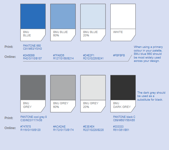
BMJ blue can also be used in three tints of 100%, 60% and 20%.
We use the 20% tint as a background colour on long documents to add pace, it can also be used for type reversed out of the solid colour. The 60% tint is used with the solid colour to create the background gradient.
BMJ Grey is predominantly used for text across both print and digital applications. However, it can also be used as a background on PowerPoint slides, set at a 20% tint.
BMJ Dark Grey can be used as a text colour for PowerPoint presentations, but should never be used as the main text colour in print publications. As a rule, always use BMJ blue for headings and BMJ grey (Pantone cool grey 9) for body copy.
Colour primary colour palette
PANTONE® standards are shown in the current edition of the Pantone Colour Formula Guide. The colours shown on this page and throughout the guidelines have not been evaluated by Pantone, Inc. for accuracy and may not match Pantone Colour Standards.
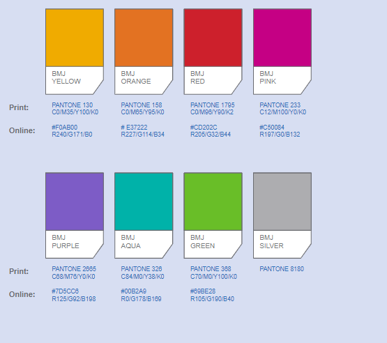
We use the secondary colour palette within illustration to add consistency and help to create a unique illustration style. In typography, we use them to highlight important headlines, body copy and active states of navigation (digital applications).
Here it is essential to maintain legibility by ensuring there is enough contrast between the selected type colour and the background. In environments, they can be used to punctuate spaces by applying them across fixtures and fittings. We use our secondary colour palette sparingly, never applying them all in one application as this can look unsophisticated.
In typography, usually one secondary colour is enough to highlight important information.
BMJ Silver is reserved for premium applications in print, such as tickets and invites to prestigious events.
Colour secondary colour palette
PANTONE® standards are shown in the current edition of the Pantone Colour Formula Guide. The colours shown on this page and throughout the guidelines have not been evaluated by Pantone, Inc. for accuracy and may not match Pantone Colour Standards.