Request use of our logos
Ingrid BrayCorporate Communications and Brand Manager

The company logo and our core product logos have been specially created to make them unique and ownable.
They must not be changed or recreated in any way. This rule also applies to core product logos. Always use approved artwork when applying any of the company branded logos.
Both digital and print file formats are available from the brand team.
Negative and positive logo application
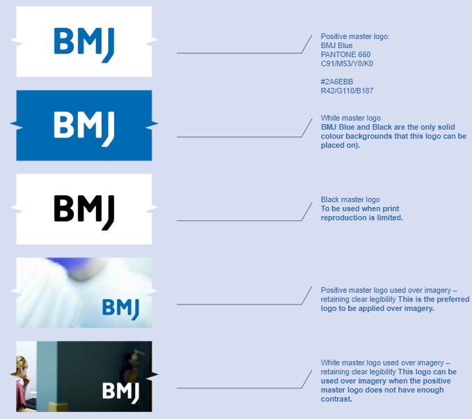
Our company logo has been reproduced in a variety of colourways to suit all applications and allow design flexibility.
Where possible we use the positive master logo and the white master logo. We don’t prioritise between these versions as their use should be determined by the media to which they they are applied. We never place logos in a box.
Both digital and print file formats are available from the brand toolkit, the company website or staff intranet brand centres.
Both the positive master logo and the white master logo can be used over imagery as long as clear legibility is retained. When applied over imagery the positive master logo is preferred, only if there is not enough contrast against the image should the white master logo be used.
The black master logo should be used when print reproduction is limited.
Clear space / Minimum size
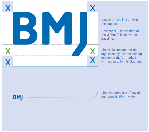
To ensure our logos always have enough space, an exclusion area has been created. This area is based on the descending part of the ‘J’ marked with a green ‘X’ in the diagram opposite.
Our logos must also be given a minimum size to remain clearly visible on all applications. This is set at 15mm wide.
Things to avoid
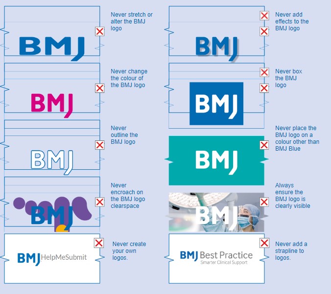
These examples show our logo being used incorrectly. Whenever you create communications for BMJ, it is important that a master artwork is used.
Never recreate, copy or alter any of our BMJ branded logos in any way. This also applies to products, internally and for campaigns.
Please always seek approval from or discuss your requirements with the brand team first: bmjbrandteam@bmj.com
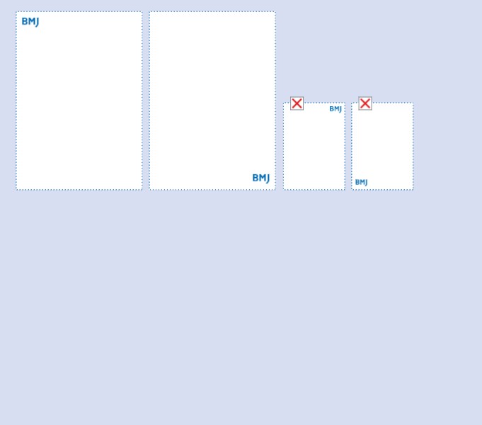
Positioning and logo size
In print, the company logo is positioned in the top left corner or in the bottom right corner.
The top left position should be used for all BMJ communications; this places the logo in its most visible position.
The logo should be applied with consideration. We avoid using multiple logos across a single document e.g. on every page of a brochure or PowerPoint presentation. As a general rule we lead or sign off with our logo.
The minimum size of the logo is 15mm wide.
There is no maximum size however please consider proportions when applying our logo to artwork.
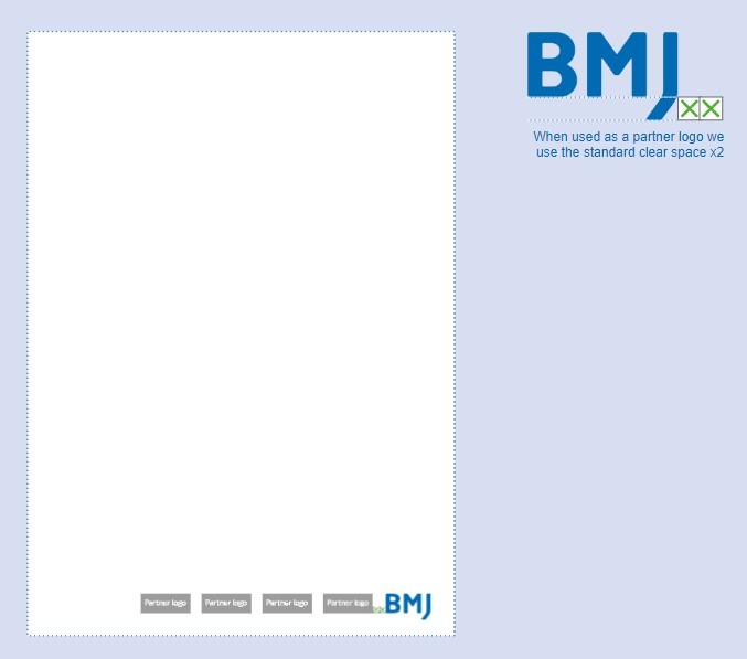
Partner logos and clear space
When working in partnership with other brands the logo is usually placed at the bottom of a document.
On these applications it is important that the logo retains good legibility, prominence and the size does not fall below the minimum of 15mm wide. To help achieve this we use the standard clearance space x2.
The application of the company logo on these applications should always be approved by the brand team.