Ingrid Bray
Corporate Communications and Brand Manager

Our primary and secondary digital colour palette has a wider range of tints for each brand colour to provide flexibility for various use cases.
Remember that less is more.
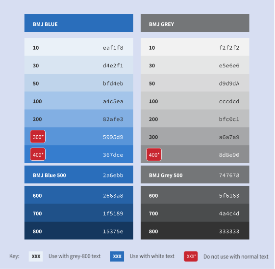
Each digital brand colour (known as the 500 tint) has ten additional tints, labelled 10 to 800. These help bring ideas to life while keeping on brand.
Always check colour contrast* if using tints for text content, or as a background to text, to ensure the difference between the text colour and background is AA (4.5) minimum.
In digital settings, our two main options for text are white (#FFFFFF) and dark grey (#333333 or BMJ Grey 800). On this and the following pages you will see the range of tints that, when used as a background to dark grey or white text, conform to accessibility standards.
In general, tints with lower numbers should be used with dark grey text (BMJ Grey 800) and those with higher numbers should be used with white text. There are a few tints (highlighted in red) that will not work with either grey or white text, so should be avoided, except in illustrations.
The text/background combinations shown here will also work in inverse – for example, BMJ Blue 500 text on a white background would also pass accessibility checks.
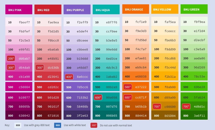
As for our primary colours, each secondary digital brand colour has ten additional tints.
Always check colour contrast* if using tints for text content, or as a background to text, to ensure the difference between the text colour and background is AA (4.5) minimum.
In digital settings, our two main options for text are white (#FFFFFF) and dark grey (#333333 or BMJ Grey 800). On this and the following page you will see the range of tints that, when used as a background to dark grey or white text, conform to accessibility standards.
In general, tints with lower numbers should be used with dark grey text (BMJ Grey 800) and those with higher numbers should be used with white text. There are a few tints (highlighted in red) that will not work with either grey or white text, so should be avoided, except in illustrations.
The text/background combinations shown here will also work in inverse – for example, BMJ Blue 500 text on a white background would also pass accessibility checks.
We adhere to the Web Content Accessibility Guidelines (WCAG 2.0) AA requirements for all new work at BMJ.
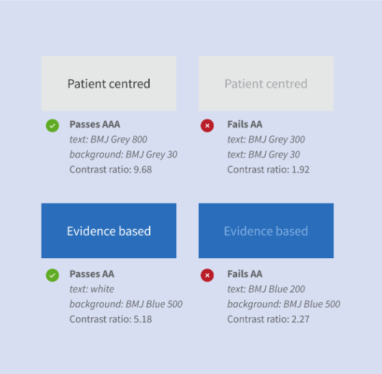
A high level of colour contrast between text and background is easier to read. This is important for users with impaired vision, as well as those who are temporarily impaired (e.g. when viewing a screen in bright sunlight).
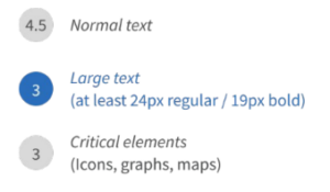
Under the guidelines, all critical content must meet at least the AA standard for colour contrast*.
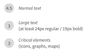
This requires a minimum contrast ratio between text and background of:
Some examples of text/background combinations that pass and fail the requirements are shown on the left.
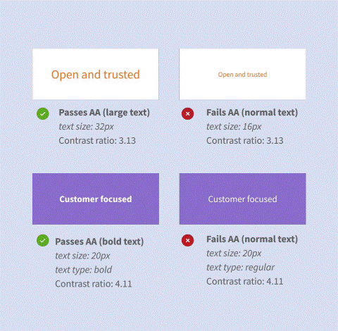
As the requirements for bold/large text are less stringent than those for normal text, you can use heavier font weights to make smaller text on a coloured background more legible.
Some examples of combinations that pass and fail the requirements are shown on the right.
Critical design elements (e.g. icons, graphs or maps) must also meet the contrast guidelines.
While decorative design elements such as illustrations do not have to meet the AA standard, you should still consider accessibility (e.g. how it might appear to people with colour blindness) in your design.