Ingrid Bray
Corporate Communications and Brand Manager

As part of our brand we have created a visual element called the fulcrum. We encourage its use where ever possible because in design, the fulcrum has become a distinctive part of our brand.
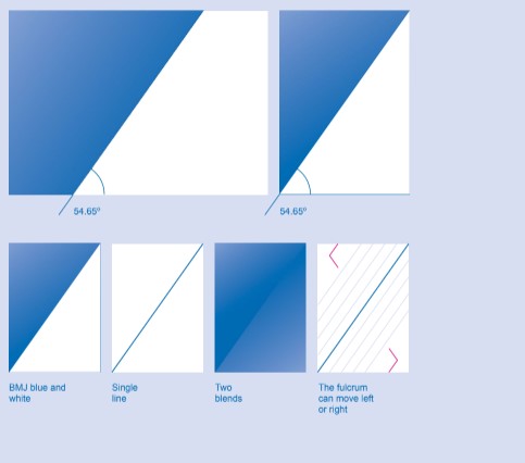
The fulcrum is used to provide a distinctive backdrop to many of our communications. It can be represented in three different ways:
BMJ blue combined with white,
As a single line, or,
As two blends butted together. When using the blend option the darker area should always be closest to the fulcrum and consistently set at 54.65º.
The fulcrum can also move left or right across any format to create more dynamic and varied communications. However, as a general rule, the blue area should never take up more than 50% of the format, this ensures there is always adequate white space (this rule does not apply to the blend option).
Online the fulcrum should never be incorporated into the user interface. It should be limited to stand alone images such as internal advertising or header images.
The fulcrum should always appear only once on a page. Either the single line or blue combined with white or two blends. If one of these fulcrums has been placed on a page, there is no need for an additional fulcrum.

The fulcrum can be used in combination with both our reportage and portrait photography styles to create dynamic layouts.
When using the fulcrum with photography, the blue corner should only ever cover a small area of the image. Refrain from using the single line fulcrum on top of a photo to avoid it looking too constructed.
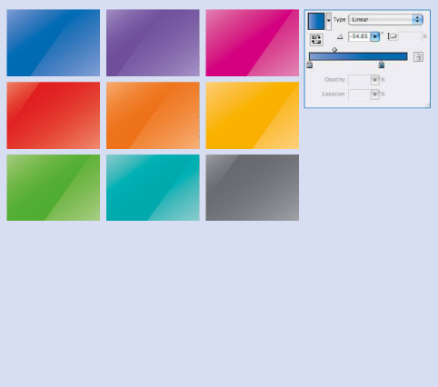
The blended fulcrum can be created using BMJ blue at 100% and 60% and our secondary palette at the same values. The blend is set consistently at 54.65º, the same angle as the fulcrum.
The secondary colour palette blends are used within documents or presentations as dividers.
They should only be used if more than one divider is required as our primary blue 660 blend should always lead.

The fulcrum can also be used in combination with our illustration style as an alternative to photography.
When using the fulcrum with illustration, blue area should sit behind an area of the illustration, helping the two elements integrate with one another.
Please note that these illustrations are placeholders only. Please do not use them.